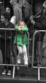
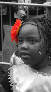
For this I decided to colour select two images as the Caribbean carnival was full of colour to make one part of the image stand out to the rest.
lindsey parker Unit 7 FMP
Friday, 22 June 2012
Caribbean Carnival
These are the shots i toke at the Caribbean carnival at Preston during half term i had difficulty getting shots as it was a moving precession and was quite busy with spectators but the decision I toke to stand in one place though out greatly helped.
Caribbean Carnival (Head Shots)
As the procession was moving along I found it easier to take shots of their heads as they were alot of movement in their body and sometime difficult to capture. I think these are the best quality as i have captured their emotions.
Tuesday, 29 May 2012
Colour Selection
Being inspired by my previuos work i decided to continue the theme of colour selection but I saw that the colour of the sweets in the cotainer being the same arnt very visually intresting but together make a good image even though that the ones around seem to be very similar after that I decided to look at sweet packets as the colours are often more vibrant and completmenting colours then to have the image stand out I then toke the decicion to only select one colour of the dark purple an example of colour selection I found is this skittles packet i found on the internet.
 |
| Original Image |
 |
| Dark Purple Colour Selection |
Shooting In Black & White
Before shooting black and white outside i decided to test the camera.
I believe this is a good image as the natural light from the window illuminates the face and give it good shadow definition.
This is my favourite image as it has a good composition of from the man standing draws your eye in with his trolley and bags make your curious as to what he is waiting for.
Wednesday, 23 May 2012
Learning Curve
By using the technique i use i found out that once you save and close the editing image that it stay as you save it so more editing can be done but not with the history brush that i use so now have to start it again.
I believe it adds more to the image rather then having just the labels coloured by it gives more colour definition and contrast as the sharp red against the pastel mixed colour labels this shows that my previous idea was correct to further develop my work in this way gives more visual interest.
Lesson learnt !
 |
| At the time of saving now stuck. |
Lesson learnt !
Label Colouring
I feel this image is visually appealing as the repetition of the labels but there is no point were your eye is drawn in because it is mono tone.
To further advance this image i am going to try and colour the lids of the containers as the sharp red colour would be a good contrast to the pastel colours of the labels.
Subscribe to:
Comments (Atom)


